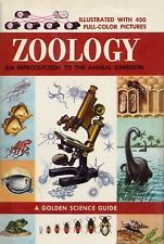
 When I was a kid growing up in a small Wisconsin town, I remember riding my bicycle over to the local department store. At the end of the isle near the toy department there was a circular rack of pocket-sized books published by “Golden Press”, typically edited or written by Dr. Herbert Zim; the Golden [science/nature] Guides . I loved these books; they were well written by experts in there field and covered a wide array of nature and science subject matter; they really fed my young curiosity at the time. When I could afford it, I would buy one of special interest to me, titles like: Photography, Color and Light, Rocks and Minerals, Oceanography, etc. I still have them in my library today.
As an adult, what is interesting about these books is the book design aspect. Each book is a highly readable package with simple straight-forward colorful illustrations, well laid out pages, good typography, organized into nourishing bites of information. The body copy typeface is Futura, which is a geometric sans-serif designed by Paul Renner and released in 1927 in Germany. Some may argue the Futura may not be the best choice for book body copy, but for this application it seems perfect. These books are pocket size, set at a relatively small point. Futura is clean and elegant and has an appearance of efficiency and forwardness.
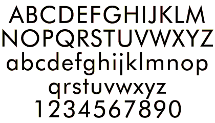 It consists of simple geometric forms: near-perfect circles, triangles and squares. It is based on strokes of near-even weight, which are low in contrast. The lowercase has tall ascenders, which rise above the cap line, and uses nearly-circular, single-storey forms for the “a” and “g”, the former previously more common in handwriting than in printed text.
“Futura is one of the most rhythmical sanserifs ever made. Its proportions are graceful and humane-close to those of Centaur in the vertical dimension. This helps to make it suitable for setting extended text.”
— Robert Bringhurst
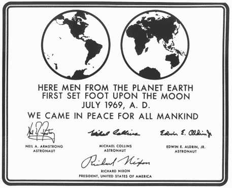
Futura goes to the moon:


Leave a Reply